
3 Things to Consider When Creating the Perfect Security Sign
A well designed Security Sign benefits an alarm company or security business in many ways. Your security yard sign serves as both a company billboard that can catch the eye of potential customers and a tool that can help deter burglars.
In a split second, the human eye recognizes colors, images, and shapes. Those are the key visual elements of your security signs. Because of the intense competition in the market among service providers, having a professionally designed yard sign can be your company’s most valuable asset.
DESIGNING THE PERFECT SECURITY SIGN COMES DOWN TO 3 IMPORTANT ELEMENTS.
1. The Color Scheme
Each color you use has meaning behind it. Some colors make you feel cautious while others make you feel safe. You can evoke powerful emotions just by choosing the right color. If you already have a logo for your company, your sign should feature the same color scheme.
If you are starting from scratch, take a look at the list below which outlines the meaning behind some of the most popular colors used in the security industry which can help you decide what works best for your company.
BLUE - Blue is the most popular color used in sign designs - and business logos in general. It represents calmness and trustworthiness. Modern designs use the color blue to signify smart technology which is appealing to today’s consumers.
RED - Red has the opposite effect. Red is associated with danger, strength, emergency, and power. It can also be combined with the color blue to symbolize patriotism.
YELLOW - Yellow has become a commonly used color. Typically yellow isn’t used alone. Yellow can be combined with black to symbolize caution. Yellow needs a strong partner to assist it, such as blue, black or grey.
GREEN - Similar to blue, green is also calming. It’s a natural color that you see everywhere in nature. Green symbolizes growth, wealth, and eco-friendly. Green combined with blue has been increasing in popularity.
BLACK - There’s an argument circulating around that black isn’t really a color. That argument is merely a distraction, whether or not it’s true, because black very much exists in sign designs. It evokes the feeling of authority and power. Use black to stimulate that feeling.
GREY - Grey is the most commonly used color in industrial environments. There has been an increase in security sign designs that use grey. There could be a number of reasons why. It could be seen as trendy/fashionable or aspirational. This gives a sense of belonging, inclusion, acceptance.

2. Shape
Sign shapes have evolved over time. In the beginning, the only shapes available were rectangles or squares. As technology evolved, it became possible to create a variety of shapes. The most commonly used shapes for security yard signs are shields and octagons.
Octagons - Octagons have and will always symbolize STOP. Even without the word, our brain immediately recognizes it as stop. It demands immediate attention and is the most popular shape for security yard signs. This shape has been made famous by ADT Security Signs which has made it a popular choice.
Shields - Shields have many variations, but still have the same impact. Whether they have a rectangle through the middle or at the bottom they still have an immediate association with security.
Badges - Badges are available in many different variations and are often associated with security and law enforcement.
The Standards - Oval, Square, Rectangle, and Circle shapes are old standbys. They are not as popular as the other options because they aren’t as unique but these shapes work well with just about any logo.
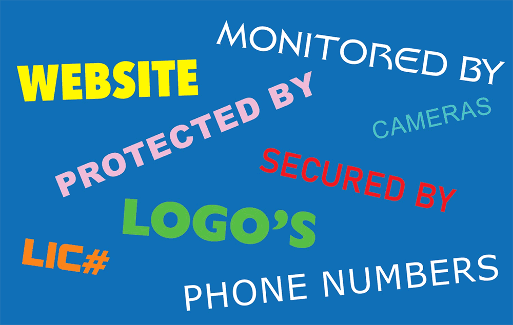
3. Information
Should my sign say Protected By or Secured By? Should I include my website? Should I exclude a phone number and only use my website?
These are the most commonly asked questions when it comes to designing a security sign. The trends for yard sign designs are evolving. There has been an increase in companies wanting a simpler, less wordy sign.
Take ADT security signs for example. ADT is the most recognized security sign in the industry yet its design is one of the simplest. The logo isn’t overwhelming and the information used is straight and to the point. Secured by, ADT logo, phone number, and lastly the website.
Some alarm companies try to cram as much information as possible onto their security yard signs but less really is more. The less cluttered the sign, the more impactful it will be.
Now onto the question of phone numbers or websites. This is a very debatable question. Some companies feel phone numbers are a waste of space and the logo and website should be as large as possible. Others feel phone numbers are still an important form of communication.
If you have a professional website, it is recommended to add both the web address and phone number to your design. Both forms of communication can be useful to consumers. Of course if your website isn’t built yet and you're still in the beginning stages of establishing your brand, using only a phone number is still perfectly acceptable.
In conclusion, there are many factors to consider when creating the perfect security signs to represent your company. If you are just getting started, it can be a bit overwhelming. Even if you’ve been a security pro for many years, you are probably not a graphic designer.
Security Signs & Decals helps to make the process easy by offering free design services on yard designs and security stickers. The best part is that you can see how your sign will look before placing your order.
If you already have a logo, just send it to us and we will design the yard sign to match your brand. Don’t have a logo? No problem! A text-only logo can be combined with one of our 16 standard shapes and vibrant colors to create a professional security yard sign to protect your customers and give your company the credibility it deserves.